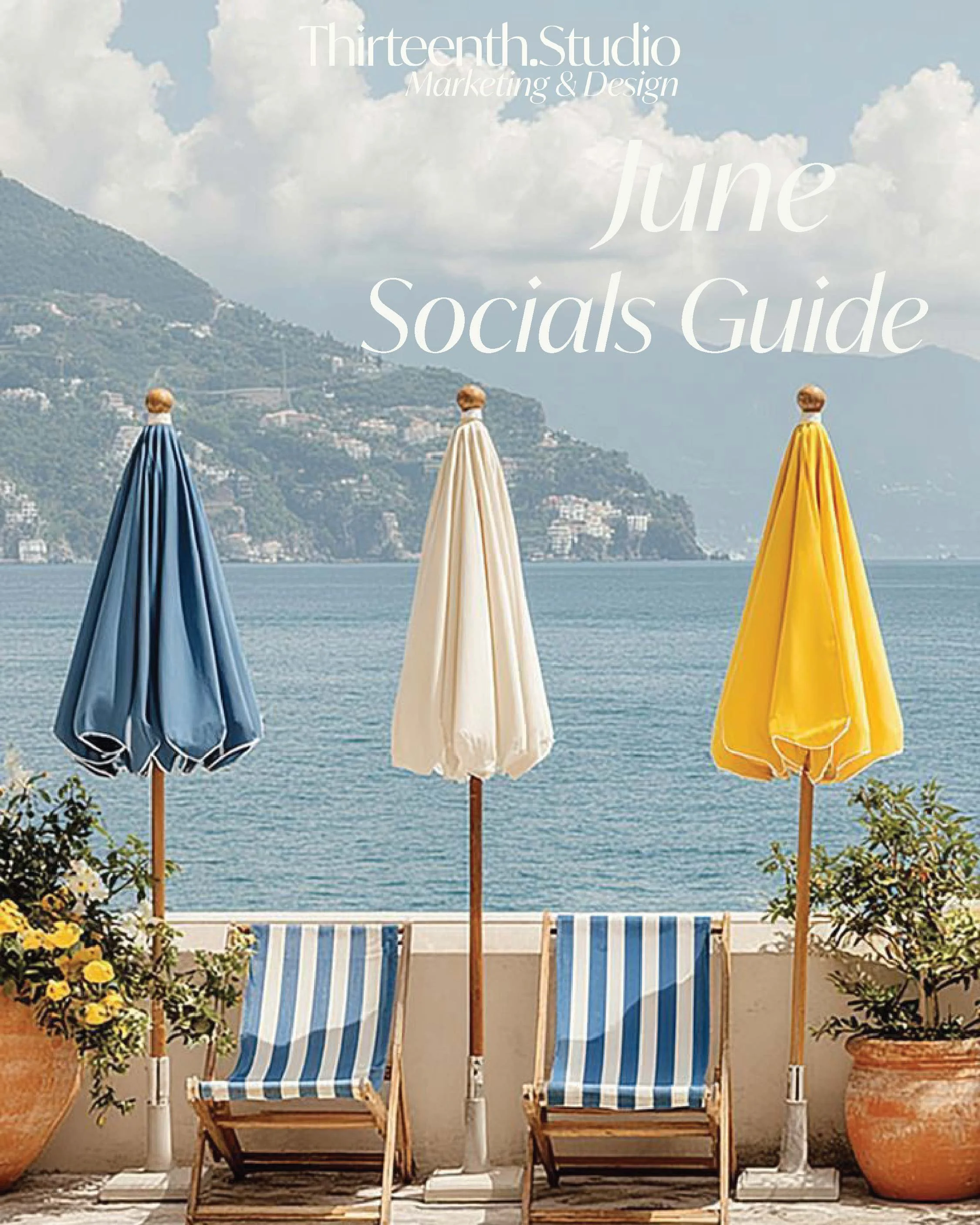
June Socials Guide for Creative Brands
Summary/Overview
Seasonal Readiness: The Start of Summer Momentum
Effortless Summer Energy: Light, Sun-Warmed Storytelling
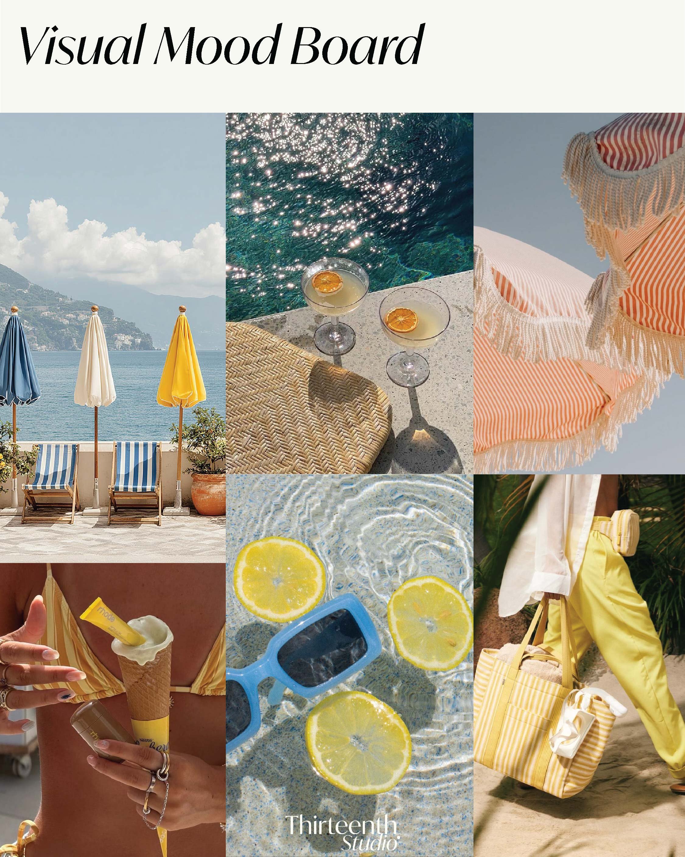
Visual Direction: Coastal Ease & Summer Detail
Colour Palette: Ocean Blues, Citrus Light & Soft Coral
Brand Tone & Messaging: The Summer Edit
Seasonal Readiness: The Start of Summer Momentum
June is where the season properly turns.
The days feel longer, plans feel lighter, and audiences are naturally more open to lifestyle-led content that reflects what summer actually feels like.
While May is a calm shift into summer, June is where brands can show up with clearer momentum- still relaxed, but more ready. It’s the perfect time to reinforce what you offer, communicate availability with ease, and lean into the season without forcing it.
At Thirteenth Studio, we see June as the beginning of summer presence: confident, consistent, and atmosphere-led.
Effortless Summer Energy: Light, Sun-Warmed Storytelling
June content doesn’t need to be louder.
It needs to feel more alive.
Effortless summer energy looks like:
A light, optimistic tone that feels natural and unforced
Sun-warmed visuals and sensory storytelling (light, texture, colour, place)
Lifestyle moments that build desire without “selling”
Simple, seasonal narratives that create cohesion across your content
Clear next steps where needed, without urgency
The strongest brands in June don’t chase trends.
They build a world your audience can step into.
Visual Direction: Coastal Ease & Summer
Visually, June is about light, colour, and atmosphere.
The direction this month leans into coastal ease- fresh air, sunlit shadows, travel cues, crisp textures, and warm details that feel editorial but still real.
This might look like:
Outdoor settings. Holiday corners. Terrace tables. Poolside textures
Linen, woven materials, glassware, citrus, fresh florals
Light movement (fabric, breeze, water, walking shots)
Brighter tones used with restraint—no over-styling
“Small moments” content that feels cinematic and calm
The goal isn’t to theme your content.
It’s to let summer elevate it.
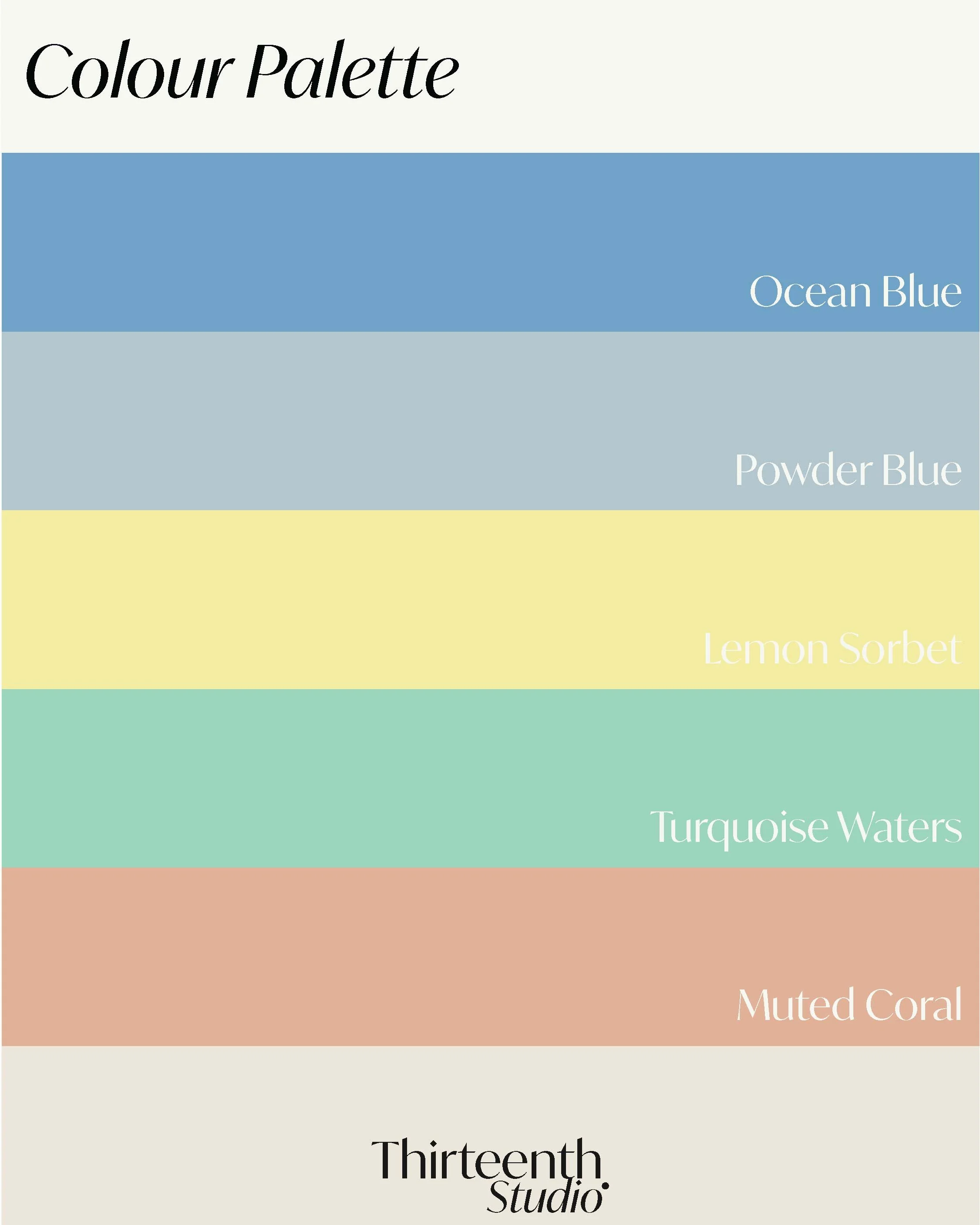
Colour Palette: Ocean Blues, Citrus Light & Soft Coral
Colour sets the emotional temperature of your bran- and in June, that temperature becomes brighter, fresher, and more sunlit.
For June, lean into tones that feel airy and coastal, but still refined:
Ocean blues that communicate calm and clarity
Powdery tones that keep visuals soft and elevated
Citrus light that adds energy in small doses
Turquoise accents that feel fresh and holiday-coded
Soft coral warmth that brings a gentle glow
June Colour Palette
Ocean Blue — calm clarity, depth, and summer composure
#83AAC7
Powder Blue — lightness, softness, and ease
#BBCBD1
Lemon Sorbet — bright optimism, warmth, and seasonal energy
#F5EC98
Turquoise Waters — freshness, movement, and holiday ease
#9FDAC6
Muted Coral — soft warmth, glow, and sunlit softness
#E1B0A0
These tones work beautifully across social graphics, mood-led carousels, seasonal photography, and campaign visuals, helping your brand feel summer-ready while staying cohesive and premium.
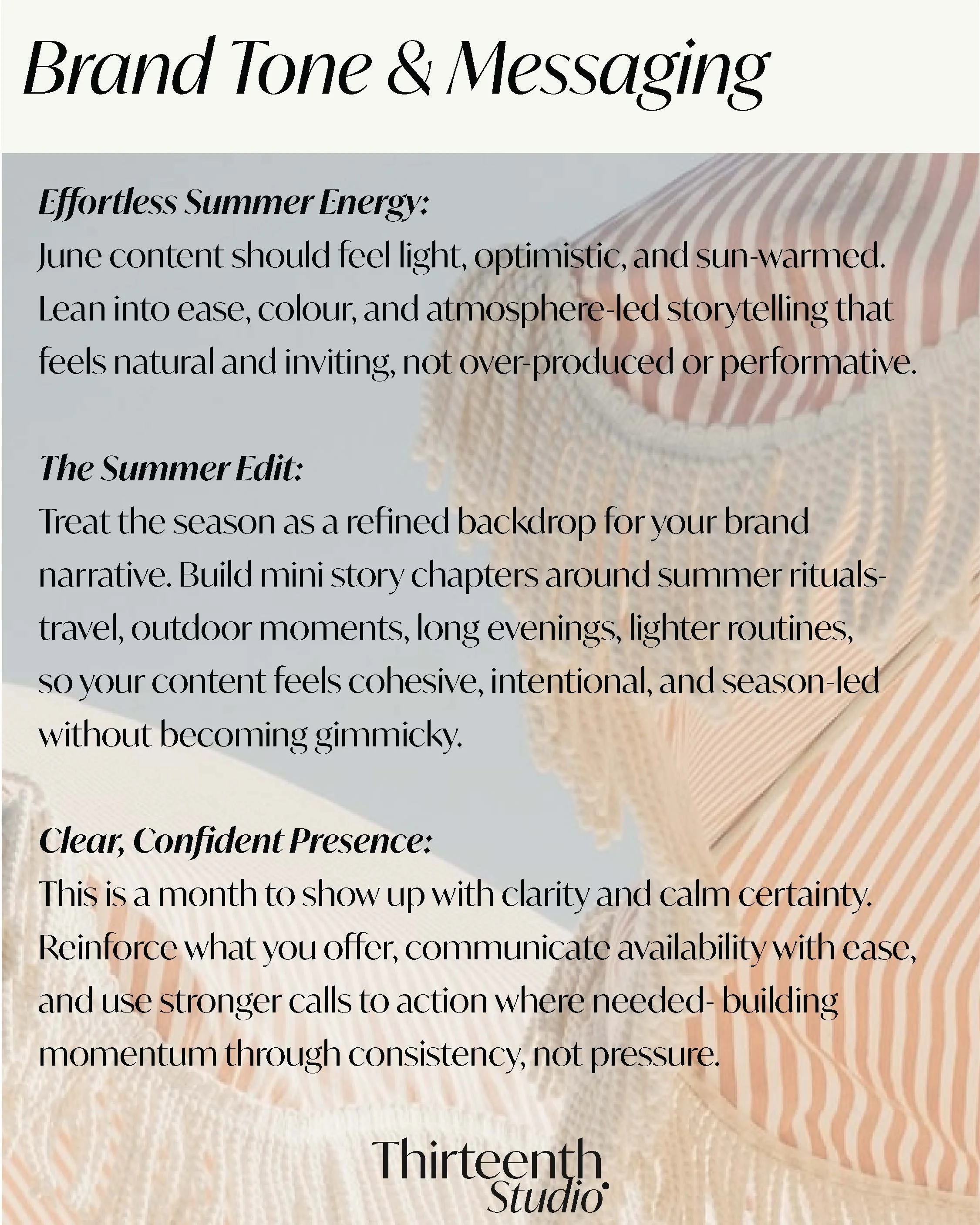
Brand Tone & Messaging: The Summer Edit
June is a month for lighter energy and clearer presence.
Messaging should feel:
Optimistic and sun-warmed
Effortless, not over-produced
Lifestyle-led and atmosphere-driven
Confident and clear (without urgency)
Consistent across visuals, offers, and storytelling
Our June guide centres around three core themes:
Effortless Summer Energy
June content should feel light, optimistic, and sun-warmed. Lean into ease, colour, and atmosphere-led storytelling that feels natural and inviting, not performative.
The Summer Edit
Treat the season as a refined backdrop for your brand narrative. Build mini story chapters around summer rituals—travel, outdoor moments, long evenings, lighter routines—so your content feels cohesive, intentional, and season-led without becoming gimmicky.
Clear, Confident Presence
This is a month to show up with clarity and calm certainty. Reinforce what you offer, communicate availability with ease, and use stronger calls to action where needed—building momentum through consistency, not pressure.
Industry-Specific Direction
Here’s how June’s themes translate across key creative industries:
Fashion Brands
June is made for summer styling, movement-led video, and “edit” storytelling that builds desire.
Lean into:
Summer capsule edits and outfit formulas (what to wear. how to style. what to pack)
Resort textures and movement-led content (fabric, walking shots, breeze, detail close-ups)
Colour stories (ocean blues, citrus, soft neutrals, sun-warmed tones)
“Get ready with me” summer moments that still feel elevated
Clear product storytelling with refined CTAs
Campaign direction:
A “June Summer Edit” series—weekly mini edits that feel effortless, wearable, and intentional.
Interiors & Textile Brands
June content should feel bright, airy, and lived-in—focused on atmosphere, texture, and seasonal styling.
Lean into:
Outdoor living and summer tables (linen, glassware, soft colour accents)
Light-filled spaces and texture close-ups
Palette-led storytelling (how colour shifts a room’s feeling)
Behind-the-scenes: sourcing, sampling, making, styling
Product-led posts that highlight quality, longevity, and detail
Campaign direction:
A “Summer Home Edit”—small styling shifts that change the mood of a space.
Lifestyle Brands
June supports ease, movement, and bright everyday living—content that feels lighter but still grounded.
Lean into:
Daily routines in brighter light (morning coffee, walks, beach days, travel prep)
Summer rituals and “small joys” storytelling
Wellness transitions (movement outdoors, lighter meals, seasonal habits)
Soft visual refreshes with ocean/citrus accents
Community-led touchpoints and gentle CTAs
Campaign direction:
A “Summer Rhythm” series—simple routines that feel realistic, calm, and aspirational.
Hospitality & Hotel Brands
June is peak season energy without needing urgency. This is where you build desire through atmosphere and experience-led storytelling.
Lean into:
Outdoor spaces in use (terraces, pools, gardens, arrival moments)
Seasonal menus and summer cocktails (with close-up detail + mood)
Golden hour interiors and service moments
Guest journey storytelling (touchpoints, details, small luxuries)
Clear availability messaging and summer stay edits / packages
Campaign direction:
A “Start of Summer Stays” narrative—experience-led content that builds desire through mood and detail.
Designing Content for Sustainable Summer Visibility
June is a visibility month—but it doesn’t need pressure.
It’s an opportunity to:
Refine your direction
Make your visuals feel lighter and more consistent
Build desire through storytelling instead of promotion
Communicate offers with calm confidence
Create content that feels seasonal, cohesive, and intentional
The goal isn’t “more.”
It’s better direction. Stronger presence. Softer confidence.
And content that makes the season feel effortless to step into.
Rounding Up
June is the start of summer, lighter energy, brighter visuals, and a more open pace.
When brands lean into effortless summer storytelling and refined seasonal direction, they create visibility that feels optimistic, calm, and compelling, while still strategic and elevated.
Purposeful content always outperforms pressure.
Building Long-Term Visibility Through Thoughtful Brand Marketing
Our June Socials Guide is designed for creative brands building long-term visibility through strategy-led storytelling, refined visual direction, and intentional brand marketing.
If you’d like support refining your brand presence for spring and beyond, we’d love to help.
→ Looking to work with Thirteenth Studio