Pantone’s Colour Direction for 2026

Summary/Overview
Why Cloud Dancer Signals a Shift Toward Calm, Considered Branding
What Pantone’s Colour Direction Really Represents
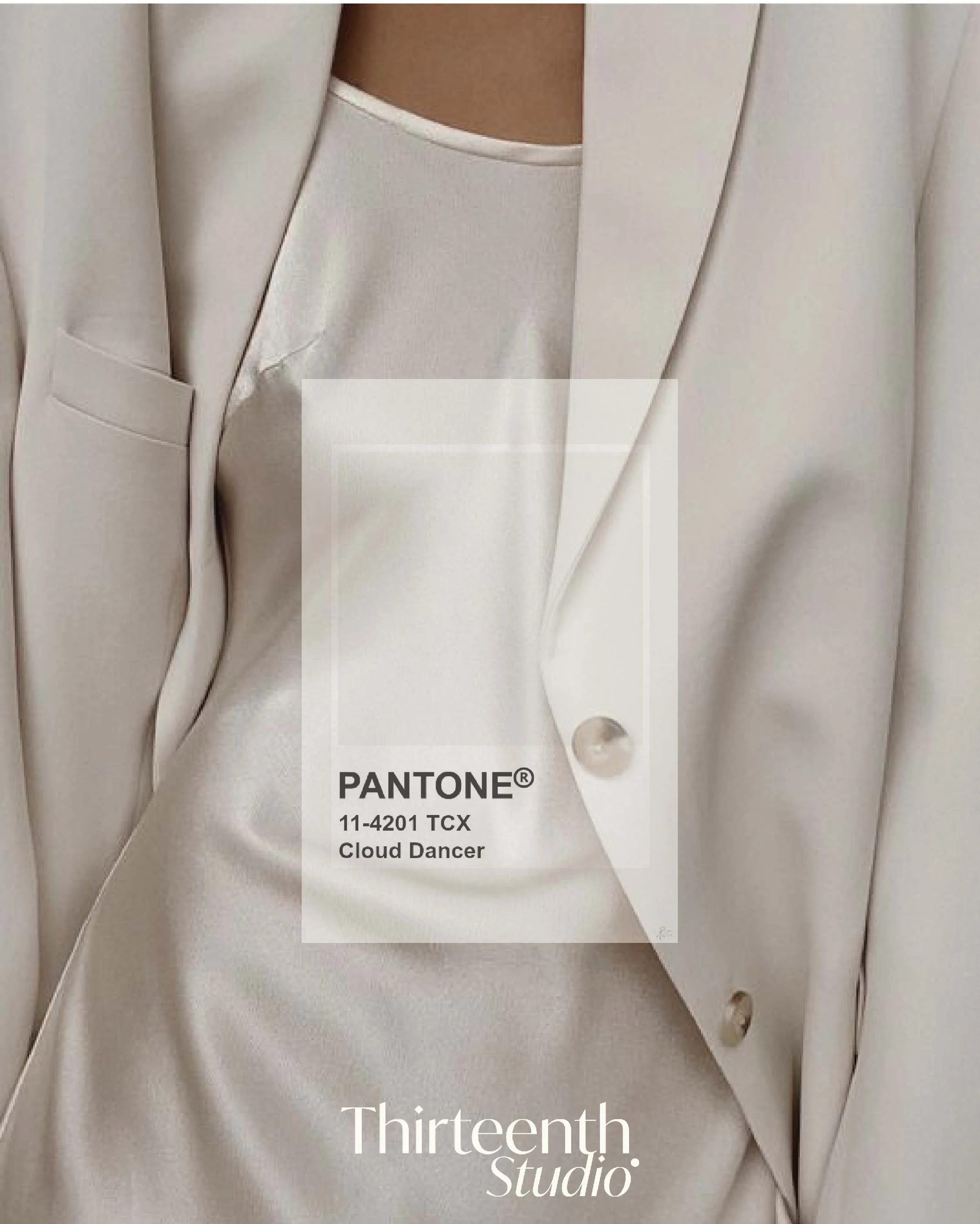
Cloud Dancer: A New Kind of Neutral
Cloud Dancer Colour Palette (Lift & Use)
What This Shift Means for Branding in 2026
How to Use Cloud Dancer Without Looking Trend-Led
Colour of the Year- Cloud Dancer
Why Cloud Dancer Signals a Shift Toward Calm, Considered Branding
Every year, brands look to Pantone for signals on where colour, culture, and visual language are heading next. And every year, we see the same pattern: a rush to use the colour- often without understanding why it matters, or whether it belongs within the brand at all.
As we move into 2026, Pantone’s emerging colour direction- referred to as Cloud Dancer, a soft, light, off-white neutral- feels less like a trend moment and more like a cultural response. A soft, calming neutral that prioritises breathability, restraint, and clarity over impact for impact’s sake.
At Thirteenth Studio, we don’t view colour of the year moments as design instructions. We see them as context- a reflection of how audiences are feeling, and how brands may need to adjust their visual language to stay relevant without chasing trends.
What Pantone’s Colour Direction Really Represents
Pantone’s annual colour forecasting isn’t about aesthetics alone. It’s a synthesis of global cultural signals- shifts in consumer behaviour, emotional needs, technology, travel, design, and how people want to feel when they interact with brands.
The move toward softer, cloud-like neutrals reflects something we’re already seeing across luxury, lifestyle, wellness, and hospitality brands:
Visual fatigue from high-contrast, overly saturated feeds
A desire for calm, warmth, and reassurance
A return to longevity over virality
Branding that feels grounding, not demanding
Cloud Dancer isn’t a “statement colour”. And that’s exactly the point.
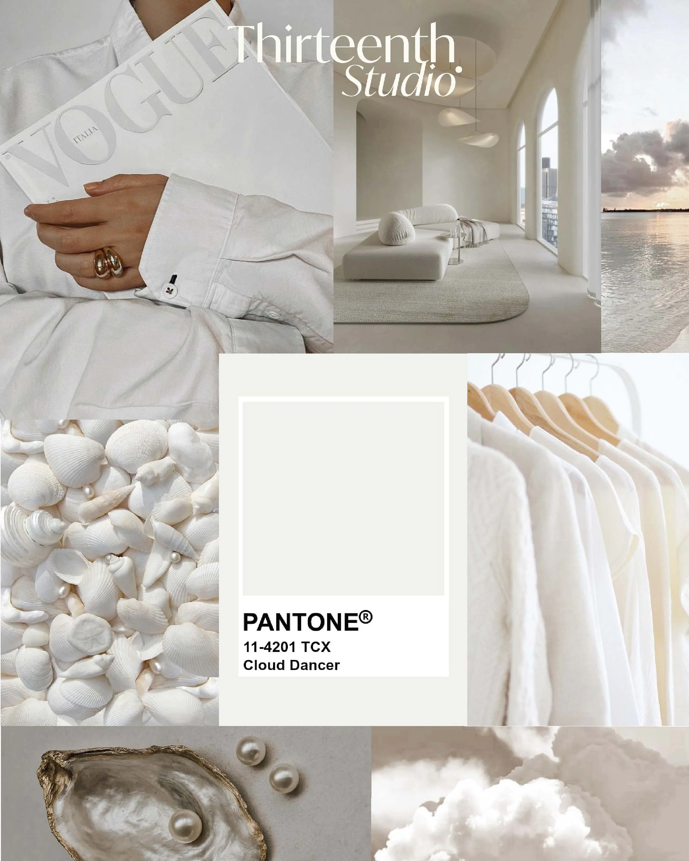
Cloud Dancer: A New Kind of Neutral
Cloud Dancer sits in a space between warm grey, soft cream, and cool beige- never stark, never cold, and never dominant. It works best as a foundation colour, allowing typography, imagery, and storytelling to breathe.
Emotionally, it communicates:
Calm without blandness
Minimalism without sterility
Luxury without excess
This is the kind of neutral that supports editorial storytelling, tactile photography, and intentional pacing- all pillars of elevated brand marketing.
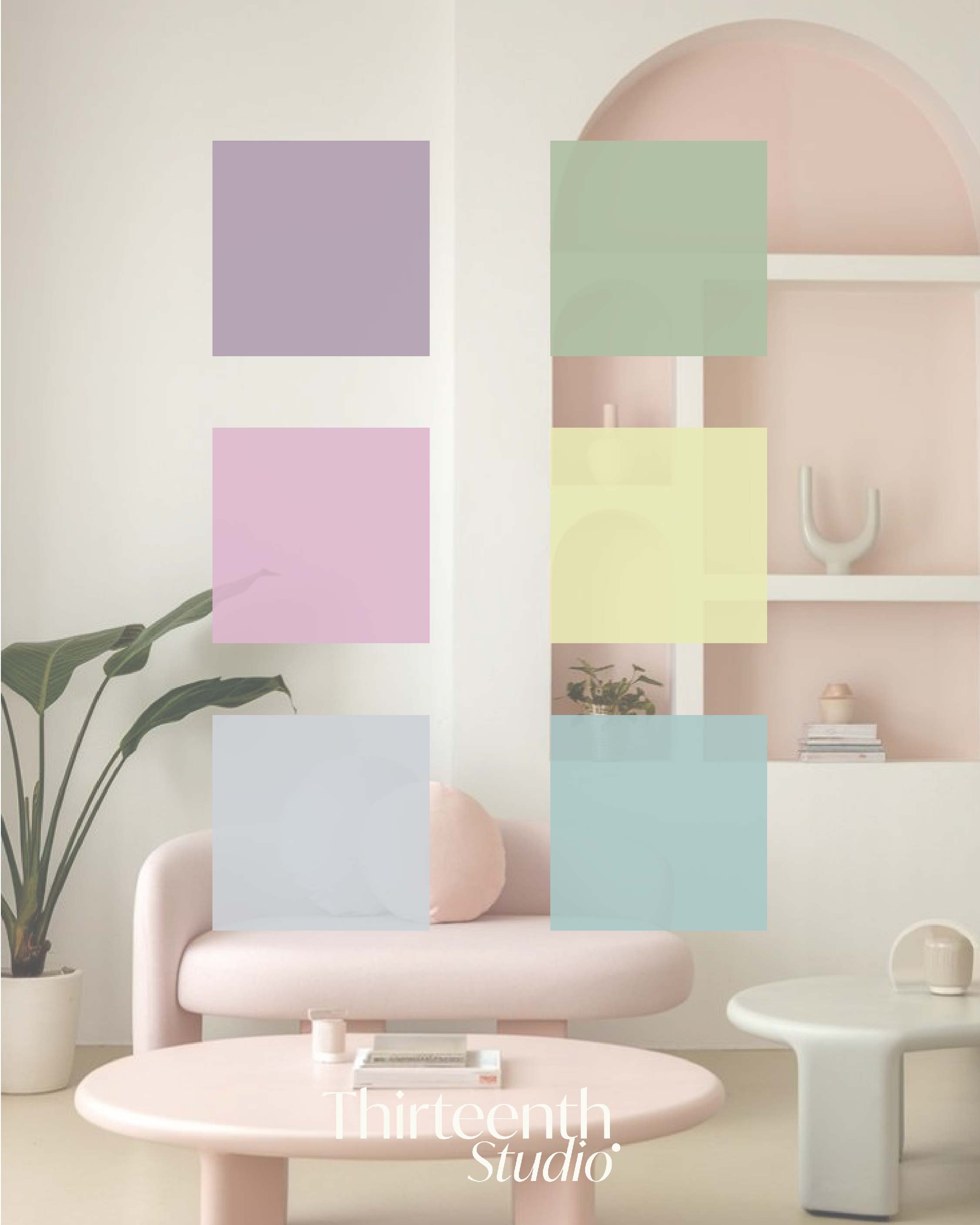
Cloud Dancer Colour Palette (Lift & Use)
For brands looking to explore this direction visually, here’s a refined soft tone pastel palette designed to complement and support Cloud Dancer:
Lavender Puff — #af9aae
Peony Petal — #ddb8cd
Blue Pebble — #cfd2d6
Muted Lemon — #e8e6b5
Soft Teal — #acc8c8
Used together, these pastel tones create depth without noise- ideal to be used together with Cloud Dancer for fresh palettes for web design, social feeds, packaging, and brand collateral where longevity matters.
What This Shift Means for Branding in 2026
Cloud Dancer signals a broader move away from visual urgency and toward considered brand systems.
We’re seeing:
Less “look at me” content
More negative space and softer pacing
Editorial photography replacing trend-led graphics
Colour used to support narrative, not dominate it
For luxury and lifestyle brands especially, this shift allows storytelling to take centre stage again- products, spaces, and experiences framed thoughtfully rather than aggressively marketed.
How to Use Cloud Dancer Without Looking Trend-Led
The key is restraint. Cloud Dancer works best when integrated subtly rather than applied universally.
Effective uses include:
Website backgrounds and whitespace
Social media feed cohesion- soft, neutral graphics & images
Typography backdrops
Packaging interiors or secondary panels
Campaign landing pages
It’s not a hero colour. It’s a supporting role, and the brands that understand that will benefit most.
Our Approach to Colour Trends at Thirteenth Studio
At Thirteenth Studio, colour is never chosen in isolation.
We approach palettes as part of a wider system:
Core brand colours remain consistent
Seasonal tones are layered intentionally
Trends inform direction, not identity
Not every brand should use Cloud Dancer- and that discernment is where strategy matters. A strong brand doesn’t adopt every cultural signal. It selects the ones that align with its story, audience, and long-term positioning.
A Considered Start Always Outperforms a Rushed One
This is the overarching theme in our January Socials Guide, and it ties beautifully here with the Pantone Colour of the Year 2026:
Cloud Dancer isn’t about doing more visually. It’s about doing things better.
As brands move through 2026, those who prioritise clarity, calm, and cohesion will stand out far more than those chasing constant reinvention. Sometimes the most powerful statement a brand can make is knowing when to soften.
If you’re refining your visual identity, social media presence, or brand foundations this year, colour should be part of a bigger conversation- not a standalone decision.
→ Looking to work with Thirteenth Studio